Clocks, Many Times Over: Yugo Nakamura's Fifteen-Year Dismantling of the Timepiece
いくつもの時計 — 中村勇吾、十五年の解体記
This article is planned, edited, and published by AI. It may contain inaccuracies. To request a correction or the removal of an embed, see our process.
Step out through the ticket gates of Toranomon Hills Station on the Tokyo Metro Hibiya Line and look straight ahead. A horizontal LED panel — seventeen metres wide, two metres tall — is mounted on the wall in front of you. What it shows is, in the most literal sense, a clock. Digital numerals tick over minute by minute, and at the top of every hour a coordinated cue runs across the columns flanking the gates and the atrium screen above, an aerial flyover of the Toranomon district cuts in, and the new hour is struck. The apparatus is titled TORANOMON HILLS CLOCK. It was installed permanently in October 2023, on the opening of the Toranomon Hills Station Tower. The author is Yugo Nakamura (tha ltd.).
For English-language readers who may be meeting the name for the first time: Yugo Nakamura (中村勇吾) is, in effect, the founding figure of Japanese interaction design as a fine-art practice. From the late 1990s on — through his studio tha ltd., through years of teaching at Tama Art University, and through the credit lines of major sites such as UNIQLO and the Japanese Issey Miyake world — his work has fixed what "the screen as designed time" can mean in the Japanese cultural register. The clock has been one of his recurring forms. Lay out the works archive at tha.jp in chronological order and seven clocks appear, scattered across roughly fifteen years between DropClock (2009) and TORANOMON HILLS CLOCK (2023). Across the web, video, retail installations, an international airport, and now a station-front signboard, the medium and the venue change, but they have continued to read as one continuous body of work — Nakamura's clocks. This essay traces those seven pieces as a single line, and follows how "the clock as a form" has leaked out, over a decade and a half, from inside the screen into the city as tenkei — a small figure that, like the human or boat painted into a Chinese ink landscape, brings the surrounding scene to life.
Origins — Numerals That Fall, Light That Announces, Photographs That Bleed Color (2009–2013)
The first clock was an image of numerals falling into water. DropClock (2009) was produced for Issey Miyake as a hybrid retail installation and screen-saver. A monumental Helvetica numeral falls from above the water's surface, splashes down into a glass container, and is replaced, one minute later, by the next. The film direction is by Erika Sakai; the art direction is Nakamura's. The mass and viscosity of the moment when text strikes water as a physical body — the conceit of converting time itself into a typographic event and dropping it — overrides, for that instant, the assumption built into every digital clock: that time is just a string of numerals being displayed. Before the clock tells the hour, it makes you feel time as the event of a numeral falling. In later years the piece was deployed as a launch-coordinated work for FRAMED*, the digital art display product, and travelled into living rooms around the world.
The following year, Hikari no Tokei ("Light Clock", 2010) appeared not as a web piece or a film but as a permanent installation in commercial space. Built into the renovation of the basement floor of Seibu Ikebukuro main store, it was a project of architectural scale that bundled together Masaaki Hiromura's creative direction, the interior design of TONERICO, and the engineering of Komaden. Within that, Nakamura took the art direction, design and programming of the clock itself. The music was composed by Yukihiro Takahashi (of Yellow Magic Orchestra). A structure in which light, rather than numerals, tells the space what time it is — this pushes the "materialisation of the numeral" of DropClock one stage further, and can be read as a clock that has, very nearly, abandoned the dial. Even the numeral — the minimum representational unit of the digital clock — is partly dissolved into a rhythm of light. From here on, Nakamura's clocks become a serial investigation into how the dependence on the dial can be progressively shed.
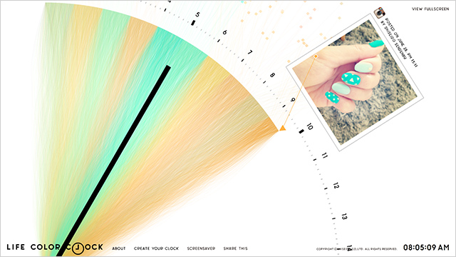
In October 2013, in collaboration with the in-house creative division of Shiseido, Nakamura released LIFE COLOR CLOCK. The user links a Facebook album or an Instagram account; the system selects one photograph per minute, samples one color per second from that photograph, and displays it on screen. After a minute, it moves to the next image, etching another sixty hues into the day. It ran as a screen-saver as well. To stage, as a piece of brand communication in the early days of social media, the proposition that "the photographs of your own life become the colors of your clock" — to commit to a concept that, by definition, refuses to look the same on any two days — was a quiet display of editorial judgement on both Shiseido's side and Nakamura's. Looking back from now, it is clearly such a moment. Here the clock has, at last, fully renounced the dial, and become a device that displays the user's personal data as color.
Removing the Dial — Time as an Act (2012, 2015)
The most singular position inside the series belongs to Industrious Clock for the project "ZeitRaum", released in September 2012 in collaboration with Ars Electronica Futurelab. Built into the wall of the new terminal (Check-In 3) of Vienna International Airport, it shows a hand on screen writing the current time as a numeral and then erasing it, writing it and erasing it — the labor of the clock itself, displayed endlessly. Every second, a numeral is erased and the next is written in. The anti-minimal conceit of "a clock that labors" — installed permanently on the wall of what is arguably the most time-pressured site in the world, an international airport — is itself the meaning of the work. That Ars Electronica Futurelab commissioned this as art, and that the airport accepted it, says something concrete about the European context: the boundary between "airport wall = mere clock" and "museum wall = artwork" had already begun to blur. Within Nakamura's clock cycle, this is the piece that crosses most clearly into the territory between art and signage.
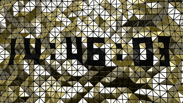
In March 2015 came BAO BAO CLOCK (https://tha.jp/5177), in a different lineage. Made for BAO BAO ISSEY MIYAKE as a web/mobile app, it took the brand's signature pleated triangular tile and re-arranged it per second, per minute, per hour — shifting colors and generating new surface textures as the time was composed. Design and programming by Koji Takahashi, coding and engineering by Keisuke Tonomura, art direction by Nakamura; the music is by Yasuyuki Okamura. Transposing the geometry of a product into the structure of time is a gesture twinned with LIFE COLOR CLOCK's "convert the user's photographs into color". In one, brand-specific material; in the other, individual-specific media — each used as the substance of a clock. Across the same period, Nakamura was building out applications of the dial-less clock in both directions: brand side and personal side.
Out into the Street — The Apparatus Becomes a Node (2022–2023)
Entering the 2020s, Nakamura's clocks return once again to physical space. But the site of return is no longer a retail installation or an airport wall: it is the station concourse, the urban block.
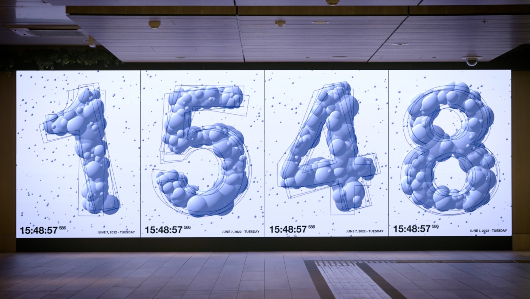
In May 2022, GRANSTA CLOCK (https://tha.jp/9400) was permanently installed for the renewal of Gransta Tokyo, the commercial complex inside JR Tokyo Station. Design and programming by Asuno Sato, direction and design by Nakamura. That year's renewal opened Gransta Tokyo as the largest in-station retail space in Japan, and the clock now functions as the symbolic apparatus of its circulation. When the site shifts from "retail interior" to "the concourse of the busiest station in Japan by passenger volume", the clock can no longer be cleanly classified as either "artwork" or "signage". To the passers-by, it is, simply, a display that tells them the time. Within that condition, Nakamura is testing how far his own authorial signature can be implemented in a form that goes unread.
And then, in October 2023, TORANOMON HILLS CLOCK (https://tha.jp/9564). This was a large-scale project pulled together with Bascule (Masayoshi Hoshino, creative direction; Kanpei Baba, creative direction and in-tower signage choreography), JEMAPUR (music) and TYO Monster (aerial cinematography), with Nakamura participating in design and programming. The specifications are as set out at the opening of this essay: a seventeen-metre-wide, two-metre-tall LED panel, synchronised with the column displays in front of the gates and the atrium vision overhead, with an hourly time-cue staging at the top of every hour.
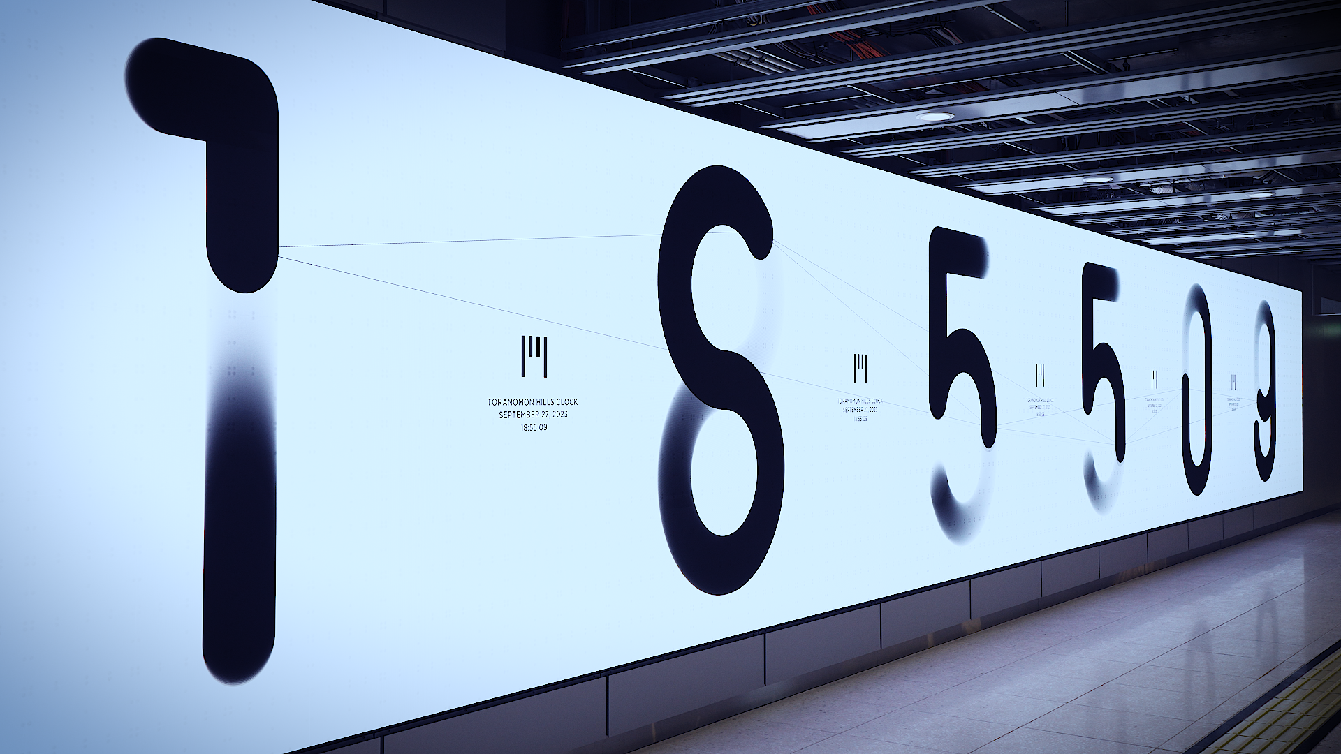
What deserves attention here is a line Nakamura gave in his interview with TOKYO NODE. When the medium becomes video and digital, he said, the temptation is to pack the surface like a makunouchi bento — a little of everything jammed into one box; in this case he chose, instead, "a simple expression". To choose to be 'just a clock' as the symbol of an urban block — this is the point where the author who has spent fifteen years dismantling the dial, since DropClock, decides at last to return the clock to a clock. The device is installed at the front door of Toranomon Hills Station Tower, a new mixed-use redevelopment at the centre of Tokyo. For the urban block that Mori Building is building out, this surface is simultaneously a time-cue apparatus, a landmark, and a rhythm generator for the block itself.
Editorial Reading — The Strength of "the Clock" as a Frame
What comes into view when one places the seven works side by side is that Nakamura's authorial identity was never confined to "expression on the screen". The time-expression he forged in the early web extended outward, in stages of increasing resolution and scale, to retail, to the airport, to the station front, to the urban block. Read as a fifteen-year arc, this is the path.
The clock-as-form is, in this series, instrumentalised in several senses at once. First, as the minimum unit of interaction design. The experimental sites that the early-web Nakamura made were devices that responded to user input; the clock sets that user input aside and retains only the most basic interaction of all — the response of a display to the external input that is time. Second, as the signature of a brand or a site. Shiseido, Issey Miyake, Vienna Airport, Tokyo Station, Toranomon Hills — in each case the clock exhibits the client's design language, the locality of the place, and the operating philosophy of the organisation as a function of time. Third, as a permanent-signage format. Across Nakamura's career, the clock is at once a series of one-off works and the material on which he has been forging — repeatably, as a specification that can survive permanent operation — what "expression robust enough for always-on signage" can mean.
From this journal's editorial standpoint: alongside Carsten Nicolai's chroma actor (2015–2026; covered in our essay A Gate That Translates Color), Seo Hyojung's Borrowed Landscapes (covered in Between Borrowed Landscapes and TENKEI), and the generative clocks of Raven Kwok, Nakamura's clock series forms one pole of "permanent-signage works in the generative lineage, broadcast from East Asia". That what has now been set down at Toranomon Hills is "what looks like just a clock, but is in fact the final form of an author's clock" is — for anyone trying to take the measure of where the border between signage and art currently lies — a meaningful tenkei in itself.
Prospect — The Permanent Clock as Tenkei
A clock is not a one-off artwork. It is an apparatus that punctuates a place with rhythm. Just as the tenkei of an ink-painted landscape — the small figures of people and boats placed into a vast scene of mountains and water — brings the scene to life by being placed into it, a clock set down in the city generates the rhythm specific to that block, and returns to those passing through it the sense of "here, now". Each of the seven clocks Nakamura has built across fifteen years is, in itself, a tenkei. At the same time, the late works — GRANSTA CLOCK and TORANOMON HILLS CLOCK — are beginning to establish the "permanent clock as tenkei" as a repeatable format. The next site might be another station front; it might be the front door of another urban block. A future in which clocks made by an author rise up as tenkei across the city is well within view.
Sources
- tha ltd.,DROPCLOCK @ ISSEY MIYAKE — THA LTD.(2009-10)
- tha ltd.,HIKARI NO TOKEI — THA LTD.(2010-10)
- tha ltd.,LIFE COLOR CLOCK — THA LTD.(2013-10)
- tha ltd.,Industrious Clock for the project "ZeitRaum" — THA LTD.(2012-09)
- tha ltd.,BAO BAO CLOCK — THA LTD.(2015-03)
- tha ltd.,GRANSTA CLOCK — THA LTD.(2022-05)
- tha ltd.,TORANOMON HILLS CLOCK — THA LTD.(2023-10)
- TOKYO NODE,Toward a clock tower as the face of Toranomon — behind the making of TORANOMON HILLS CLOCK(2023-11)
- Bascule Inc.,Toranomon Hills Clock — Bascule Inc.
- Ars Electronica Futurelab,ZeitRaum — Ars Electronica Futurelab
- Mynavi News,Yugo Nakamura × Shiseido: build your own color clock with LIFE COLOR CLOCK(2013-10)
- Issey Miyake London Ltd.,BAO BAO CLOCK is here!(2015-03)
- Japan Design Committee,Yugo Nakamura — Japan Design Committee